Friday, December 19, 2014

If I Were a Font.... ♪


If I were to be a font, I would choose the font "Basic Title." I like how it's simple, and looks very modern.

I also like the Pokemon font because it's cool how the letters are different sizes and are uneven. I also like the cartoonish look of the typeface.

Green Team Q&A and Concept Board


♪  How did the club begin? What is the goal of the club?

The Green Team began as a student-led club. Its goal is to spread awareness of living green, preserving the environment, environmental issues, and growing food organically.

♪ What do you want the logo to represent?

I want the logo to represent community, teamwork, being green, and gardening.

♪ Why did you join the green team? What have you learned?

I joined the green team because I was always interested in learning about the environment and I thought it would be really cool to grow my own plants, vegetables, and herbs locally. I've learned to work together as a team as well as new ways to conserve energy and be environmentally friendly.

♪ What are 5 things you think of when you hear "green team" or "environment?"

I think of community, plants, farm, learning, and team.

♪ What colors do you think represent the club?

Green, blue, brown, silver.

Concept Board

Tuesday, December 16, 2014

Logos ♪

                                 
Although I personally don't use Firefox, I like the logo. I like how it's simple, but cute. Having the fox hugging the globe is to show that the browser is used worldwide, and has a large outreach. I also like how the fox's tail looks like flames, which connects to the name "firefox."

                                    Home Table House by Dani Janev


I'm not familiar with this logo, but I really like how the first letters of the name "Home Table House" are shaped. It's cool how the "h's" are shaped like chairs, and how the "T" is shaped like a table. It's simple, but clever.
                                        Ark by Inkwill Design
I also really like this logo because it's simple and cute~ I wonder what the logo is for...

Wednesday, December 10, 2014

Portrait Transformation

Original Image

New background

Final Edited Image   

For my concept, I wanted to show an image can change if you simply change the background. I wanted to keep a similar background while emphasizing Mei Lin's position in the photo. Her pose makes her look a bit lost, since she is in a crouched position and on her phone. To create my image, I edited the original image using image adjustments, chose a new background, then used the lasso tool to copy and paste her body onto the new background.
In my final image, I cloned her several times to show my idea. I also wanted to have a concept of "hide and seek," and tried to make her clones blend into the background. To make my edited image more realistic, I created and added shadows to each of the clones, and adjusted the lighting and brightness as needed.


Sunday, November 23, 2014

GIF & Reflection


      The most difficult part of the project was figuring out how to use Photoshop. Despite having a packet describing each tool, it was hard using the program firsthand, as there were so many tools with so many different uses. Something that I struggled with was using layers. Initially, I didn't realize that I needed to duplicate the layer I had just finished before moving on to the next layer, so I would have a different part of my symbol on each layer. As a result, I had to do a lot of duplicating and merging between layers to achieve my final result. Another frustrating aspect of Photoshop was that the undo button only allowed me to undo the last change that I made, but I found a way around that. Thinking back, was there an actual undo button...? If there was, I didn't find it, haha.
     After completing the project, I feel the most confident in using the eyedropper tool... At first, I didn't know the function of the eyedropper tool, so I would try to manually find the same color, which didn't work out very well. The eyedropper tool is really useful. I also feel confident in using the paintbrush tool because it's the tool that I used the most. I wanted to use the elliptical marquee tool, but when it didn't make the shapes that I had in mind, I decided to make them myself using the paintbrush tool. I also gained more experience in using the transformation tool, as I had to rotate the leaf and the toothbrush.
     I wish I was better at using the elliptical marquee tool. If I were better at using it, I probably would have been able to save some time, as I used the paintbrush tool for everything aside from the outline of the leaf on the frog's head. And although I said I was the most comfortable with using the paintbrush tool, I still find it hard to use sometimes. It's not very precise, and I would have to keep undoing or erasing parts of what I drew because it's not what I wanted it to look. Next time, I want to utilize more tools on the program so I will have more experience with each of them. 
     The next time I use Photoshop, I want to try editing a photo instead of creating something from scratch. I think it would be really interesting to see what I can do with a picture that I took, such as combining or layering it with another image, or drawing on top of it. Although Photoshop is hard to use, I'm looking forward to using more tools and trying new things out. Maybe after I get more used to Photoshop I will find the program less tedious to use. I was always interested in using the program, and it's cool that I get to try it out while creating my own files.
   I tried to convey the concept of nighttime. To do this, I had my frog brushing its teeth (thinking more about it now, I'm pretty sure frogs don't even have teeth... but it's okay, mine is a cartoon frog~) to show how we brush our teeth before we go to bed as a routine. I also emphasized a night sky, because brushing teeth can also be a part of the morning.

Sunday, October 26, 2014

GIF 。◕‿◕。


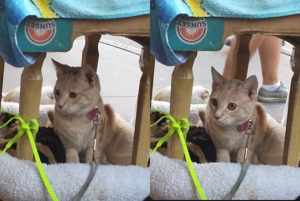
Note: This isn't my cat (but I wish it was ᵔᴥᵔ)

Concept Board


Ivan Chermayeff and Tom Geismar are prominent in the design world, as they are involved in every aspect- graphics, print, logos, posters, packaging, and so on. They both graduated from Yale University of Art and Architecture in 1957, and have been in business since 1958, when they opened their own graphic design firm. Since then, they have been pioneering and emphasizing the modern movement. Their work emerged during the 50s and early 60s, a time of graphic revolution, as only a few graphic designers were well known at the time. Around 1960, they began the "craze" for abstract corporate symbols, such as the logo for Chase bank. Chermayeff and Geismar have since re-designed and created identities for numerous major institutions, and their design firm is behind the logos for many major iconic brands such as National Geographic, NYU, and NBC.

(reposted because the font was different from the rest of my blog, and wouldn't change back)