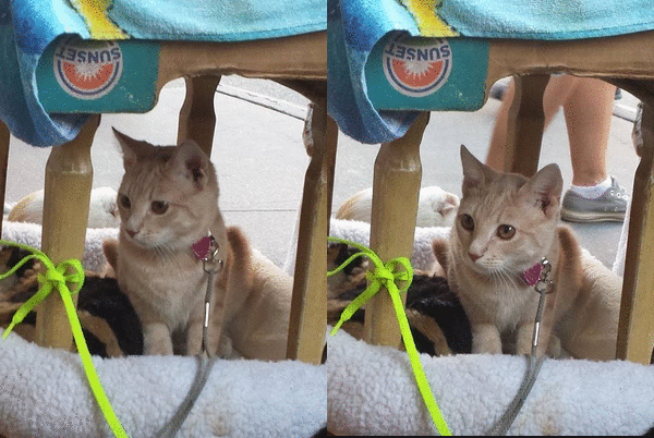
Note: This isn't my cat (but I wish it was ᵔᴥᵔ)
Sunday, October 26, 2014
Concept Board
Ivan Chermayeff and Tom Geismar are prominent in the design world, as they are involved in every aspect- graphics, print, logos, posters, packaging, and so on. They both graduated from Yale University of Art and Architecture in 1957, and have been in business since 1958, when they opened their own graphic design firm. Since then, they have been pioneering and emphasizing the modern movement. Their work emerged during the 50s and early 60s, a time of graphic revolution, as only a few graphic designers were well known at the time. Around 1960, they began the "craze" for abstract corporate symbols, such as the logo for Chase bank. Chermayeff and Geismar have since re-designed and created identities for numerous major institutions, and their design firm is behind the logos for many major iconic brands such as National Geographic, NYU, and NBC.
(reposted because the font was different from the rest of my blog, and wouldn't change back)
Wednesday, October 8, 2014
"Good" Graphic Design
I think this is greeting card is an example of "good" graphic design. I chose this card because it's simple, yet eye catching (and it's cute). It also has a purpose, as it is a card for an anniversary, and the images and text help convey the message. I think it stands out because the pairs in the design go well together, such as salt and pepper or cookies and milk. The text is casual and adds onto the theme, and having the images and text form a heart helps bring the entire design together.
Found in Walgreens pharmacy~

Monday, October 6, 2014
Inspirations & Interests ♪

Letter Project Reflection =^• ㅅ •^=
- Describe your process when creating your letter project. How was the process helpful or not so helpful to you?
I started my process of creating my letter project by sketching twenty possible designs of a letter, then narrowed it down to three designs through peer editing. This was helpful for me because I had a few designs in mind, and my table chose those designs. Afterwards, I chose two designs and drafted them on copy paper. The gallery walk that followed was helpful for me because it helped me decide which design I wanted to create for my final. The input from my classmates gave me ideas on how to improve my design.
- How did you arrive with your concept/idea for your letter? How did you represent this concept visually in your design?
I don't think it was too difficult to arrive at the concept for my letter. I chose to design the letter "O" because it's a simple letter, and I like how it's round. My concept came from both the letter I chose, and my interests. Because I chose the letter "O" and because one of my interests is food, I decided to combine them. When I was working on the initial sketches, I drew a lot of food that is shaped like the letter "O," and some happened to start with the letter, too- Oreo's and oranges, for example. I eventually chose a pizza. I used a color scheme of mostly warm colors like red, orange, and brown, and added a bit of contrast with green. I think using the green helped unify my design more, as green and red are complementary colors. To add onto my concept, instead of just having regular pizza toppings, like pepperoni and mushrooms, I chose to add other foods that I like, such as M&M's and cherries. The additional toppings are unusual, as they aren't usually found on pizzas, but they fit into my design, as well as my preferences. I also wanted to make my design look cartoon-ish, but have realistic colors. The bite marks in the middle help emphasize both the letter and the cartoon look.
- What was the most challenging aspect of this project for you? Why?
The most challenging aspect of the project for me was adding color to my design. Since my design is a pizza, I had to combine different shades to create the end result. For the cheese part of the pizza, I overlapped different shades of orange, red, yellow, and brown, and for the crust, I did the same using different shades of brown. Even though my pizza is cartoon-ish, I wanted to make the colors look realistic. This was difficult for me because I didn't want to make the colors look too dark, and as a result, my coloring, and the color payoff, was not as bold as it could have been.
- Are you satisfied with your project? Explain your answer.
I'm satisfied with my project overall. Initially I thought that my design was too simple, but I think I like it that way. I'm not sure how it would look if I somehow made it more complex, but I don't think it would look as nice. I like the way it turned out, but if I could, I would make some adjustments to it.
- If you can change anything about your design, what would you change or do differently?
If I could do something differently, I would try to make my design stand out more. During the class discussion, I noticed that mine was somewhat hard to see from from away because of the way it was colored. To change this, I would try to add more color to my design while staying within my color scheme. However, with that said, I still like my design, and I think it looks nice up close.Final~ 
In the process~
Subscribe to:
Posts (Atom)


