A book cover that I like...
I remember reading To Kill a Mockingbird by Harper Lee in middle school. Although I wouldn't say this book is my favorite, I like the different covers of the book. I think I read this version:

I remember seeing this book cover and thinking it was nice. I like how it's simple, and how the colors in the image contrast the light purple of the rest of the cover.
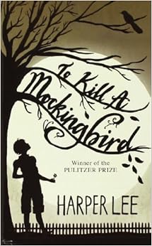
I've never seen this cover before, but I like this one better than the cover of the one that I read because the tree with the bare branches, the crow, and the dark colors convey the dark theme of the book really well. The image also gives off an eerie feel, and would attract me into picking up the book.
 |
| 1 |
 |
| 2 |
 |
| 3 |
 |
| 4 |
 |
| 5 |
1♪ I like this book cover because it's very simple, and the milk bottle attracted me. I also like the typography used.
2♪ I like how the image contrasts the white background of the rest of the page and stands out. I like how the image is like a paint splatter, and we only get a glimpse of what it is showing.
3♪ I like this book cover because the colors blend nicely together. I like how the background is light, but the color of the pomegranate and its seeds make the cover stand out. (I also like how there's food on the cover~)
4♪ I like this book cover when I first saw it because I thought the whales were cute. I like how they're not facing the same way, but they're all aligned. I also like the colors used- they look good together.
5♪ This book cover looks simple, yet is bold. I like how the pencils are all bright colors. I noticed how the ends of the pencils are aligned, but the tips are all different lengths.
♪ I noticed that all 5 of the book covers I chose are pretty simple, and some of the color choices are light, and some are more bold, yet they all stand out. I also think all of the covers are unified.
I like the pencil book cover because it is very interesting and cool design. The color of the pencils are colorful and bright which make it attractive. The only thing is that the font is small and I don't know what is the title.
ReplyDeleteThe book cover with the color pencils is really interesting to look at. They are really simplistic writing utensils and just make the book cover seem simple yet complicated.
ReplyDeleteI like the first book cover(1) for the same reasons you do. The bottle of milk, in contrast with the black background, was a very strong focal point. Then I looked around the bottle and noticed the words. It is because the typography was in script that my eyes were moved around the page, allowing me to predict about the book's contents.
ReplyDeleteThis comment has been removed by the author.
ReplyDeleteDenise!!!! How did you type those music notes?!?! The pencil one looks really interesting. I have a feeling that the setting would be set in school or an office. Milk looks really interesting to I bet it's about a grocery store adventure.
ReplyDelete