Wednesday, April 29, 2015
Microaggressions
I can think of some small moments where people have made assumptions about me based on my race. I've been asked where I was from even though I was born here, and some people just assume that all Asians are born in Asia. I've gotten shocked looks when I haven't done as well on a test or assignment, revealing the stereotype that all Asians are very intelligent, and always do well academically. People have also made assumptions about my race based on my appearance, noting that my eyes are too big and my hair is too wavy for me to be Chinese (or even Asian). Some have even tried to guess my background- Vietnamese, Filipino, Mexican... One time my friend's family and my family were walking together, and someone randomly shouted, "What a nice Filipino family!" Although I'm not necessarily offended by these comments, it's interesting to see how people make assumptions about and judge others solely based on their appearance or background.
Friday, March 13, 2015
What Does a Good Book Cover Look Like?
A book cover that I like...
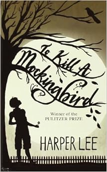
I remember reading To Kill a Mockingbird by Harper Lee in middle school. Although I wouldn't say this book is my favorite, I like the different covers of the book. I think I read this version:
I remember seeing this book cover and thinking it was nice. I like how it's simple, and how the colors in the image contrast the light purple of the rest of the cover.

I've never seen this cover before, but I like this one better than the cover of the one that I read because the tree with the bare branches, the crow, and the dark colors convey the dark theme of the book really well. The image also gives off an eerie feel, and would attract me into picking up the book.
 |
| 1 |
 |
| 2 |
 |
| 4 |
 |
| 5 |
1♪ I like this book cover because it's very simple, and the milk bottle attracted me. I also like the typography used.
2♪ I like how the image contrasts the white background of the rest of the page and stands out. I like how the image is like a paint splatter, and we only get a glimpse of what it is showing.
3♪ I like this book cover because the colors blend nicely together. I like how the background is light, but the color of the pomegranate and its seeds make the cover stand out. (I also like how there's food on the cover~)
4♪ I like this book cover when I first saw it because I thought the whales were cute. I like how they're not facing the same way, but they're all aligned. I also like the colors used- they look good together.
5♪ This book cover looks simple, yet is bold. I like how the pencils are all bright colors. I noticed how the ends of the pencils are aligned, but the tips are all different lengths.
♪ I noticed that all 5 of the book covers I chose are pretty simple, and some of the color choices are light, and some are more bold, yet they all stand out. I also think all of the covers are unified.
Wednesday, March 11, 2015
Friday, February 27, 2015
Mid-Winter Break
I didn't really do much over winter break, and I stayed home for most of the time. Very productive, I know~ However, I did finally get to go to Sake Sushi Restaurant and try their all-you-can-eat buffet after the constant urging of my friends. It was good. Here's a picture that I took:
 |
| Yum |
Part of the reason why I didn't go out much was because it was really, really cold outside. Here's a picture I took of the snow. Isn't it pretty?
Logo Reflection
What is the most successful aspect of your logo design?
♪ I think the most successful aspect of my logo design was the logo that I created! Despite it being a challenging process, I like the way that it turned out. I think it looks better than the typeface that I originally wanted to use, haha. I also like how there is a sense of unity with my logo, with the small leaf designs, the lettering, the colors, and the plant bringing everything together.
 |
| Presentation Board |
Tuesday, February 3, 2015
Art in NYC ♪
I visited the Museum of Jewish Heritage. They didn't allow photography, so I looked up the exhibit on the museum's website and found pictures:


This piece of artwork is called the Garden of Stones and opened to the public on September 17, 2003. It can be see from almost every floor of the museum. The piece is outdoors, so there weren't any others around it. It is a living memorial garden, where trees grow from stones. This exhibit drew my attention because it looks very simple, but has a powerful message once you understand the story. The garden was planted by the artist, Holocaust survivors, and their families. I think it's trying to express the passage of time, as the garden will grow and change as you revisit it. I think it also represents the passage of time since the Holocaust, but despite the tragedy the garden will continue to grow. I love the idea of having a permanent exhibit, but one that changes on it own. This exhibit was created by Andy Goldsworthy. Through research, I found out that he likes to use materials that he can't edit- mostly parts of nature. He often uses flowers, icicles, leaves, pinecones, stones, etc. to create his art.
Subscribe to:
Comments (Atom)


