Tuesday, December 23, 2014

Typefaces


This is an example of script, because it looks more handwritten.This is appropriate for wrapping paper because it is meant to be cute and festive. Found on wrapping paper.


This is an example of a modern font. You can see that the letters have a vertical axis. Additionally, the letters have varying thickness in lines. Found on a Barnes & Noble bag.


The "citrus burst" and "eureka lemon & key lime" typefaces are both decorative, as they are meant for a title, and it would be difficult to read a long text in those fonts. The typefaces were meant to attract others. The "sunkist" typeface is an example of slab serif, because there are serifs at the top or bottom of the letters. Found on packaging.


This is an example of a decorative typeface, as the "hot" stands out, and is meant to be decoration. It would be hard to read this font if it was smaller, or if it was written in a paper. Found in Potbelly.


The typeface on my friend's phone is decorative, as we typically don't see fonts that are in the shape of a square. It was also meant for decoration, but is also simple and easy to read. 


The typeface on these stickers is sans serif, because there are no serifs on the top or bottom of the letters. Each letter has the same thickness, and is also very easy to read. The font is simple, and makes the sticker stand out, along with the sparkly colors.


Friday, December 19, 2014

If I Were a Font.... ♪


If I were to be a font, I would choose the font "Basic Title." I like how it's simple, and looks very modern.

I also like the Pokemon font because it's cool how the letters are different sizes and are uneven. I also like the cartoonish look of the typeface.

Green Team Q&A and Concept Board


♪  How did the club begin? What is the goal of the club?

The Green Team began as a student-led club. Its goal is to spread awareness of living green, preserving the environment, environmental issues, and growing food organically.

♪ What do you want the logo to represent?

I want the logo to represent community, teamwork, being green, and gardening.

♪ Why did you join the green team? What have you learned?

I joined the green team because I was always interested in learning about the environment and I thought it would be really cool to grow my own plants, vegetables, and herbs locally. I've learned to work together as a team as well as new ways to conserve energy and be environmentally friendly.

♪ What are 5 things you think of when you hear "green team" or "environment?"

I think of community, plants, farm, learning, and team.

♪ What colors do you think represent the club?

Green, blue, brown, silver.

Concept Board

Tuesday, December 16, 2014

Logos ♪

                                 
Although I personally don't use Firefox, I like the logo. I like how it's simple, but cute. Having the fox hugging the globe is to show that the browser is used worldwide, and has a large outreach. I also like how the fox's tail looks like flames, which connects to the name "firefox."

                                    Home Table House by Dani Janev


I'm not familiar with this logo, but I really like how the first letters of the name "Home Table House" are shaped. It's cool how the "h's" are shaped like chairs, and how the "T" is shaped like a table. It's simple, but clever.
                                        Ark by Inkwill Design
I also really like this logo because it's simple and cute~ I wonder what the logo is for...

Wednesday, December 10, 2014

Portrait Transformation

Original Image

New background

Final Edited Image   

For my concept, I wanted to show an image can change if you simply change the background. I wanted to keep a similar background while emphasizing Mei Lin's position in the photo. Her pose makes her look a bit lost, since she is in a crouched position and on her phone. To create my image, I edited the original image using image adjustments, chose a new background, then used the lasso tool to copy and paste her body onto the new background.
In my final image, I cloned her several times to show my idea. I also wanted to have a concept of "hide and seek," and tried to make her clones blend into the background. To make my edited image more realistic, I created and added shadows to each of the clones, and adjusted the lighting and brightness as needed.


Sunday, November 23, 2014

GIF & Reflection


      The most difficult part of the project was figuring out how to use Photoshop. Despite having a packet describing each tool, it was hard using the program firsthand, as there were so many tools with so many different uses. Something that I struggled with was using layers. Initially, I didn't realize that I needed to duplicate the layer I had just finished before moving on to the next layer, so I would have a different part of my symbol on each layer. As a result, I had to do a lot of duplicating and merging between layers to achieve my final result. Another frustrating aspect of Photoshop was that the undo button only allowed me to undo the last change that I made, but I found a way around that. Thinking back, was there an actual undo button...? If there was, I didn't find it, haha.
     After completing the project, I feel the most confident in using the eyedropper tool... At first, I didn't know the function of the eyedropper tool, so I would try to manually find the same color, which didn't work out very well. The eyedropper tool is really useful. I also feel confident in using the paintbrush tool because it's the tool that I used the most. I wanted to use the elliptical marquee tool, but when it didn't make the shapes that I had in mind, I decided to make them myself using the paintbrush tool. I also gained more experience in using the transformation tool, as I had to rotate the leaf and the toothbrush.
     I wish I was better at using the elliptical marquee tool. If I were better at using it, I probably would have been able to save some time, as I used the paintbrush tool for everything aside from the outline of the leaf on the frog's head. And although I said I was the most comfortable with using the paintbrush tool, I still find it hard to use sometimes. It's not very precise, and I would have to keep undoing or erasing parts of what I drew because it's not what I wanted it to look. Next time, I want to utilize more tools on the program so I will have more experience with each of them. 
     The next time I use Photoshop, I want to try editing a photo instead of creating something from scratch. I think it would be really interesting to see what I can do with a picture that I took, such as combining or layering it with another image, or drawing on top of it. Although Photoshop is hard to use, I'm looking forward to using more tools and trying new things out. Maybe after I get more used to Photoshop I will find the program less tedious to use. I was always interested in using the program, and it's cool that I get to try it out while creating my own files.
   I tried to convey the concept of nighttime. To do this, I had my frog brushing its teeth (thinking more about it now, I'm pretty sure frogs don't even have teeth... but it's okay, mine is a cartoon frog~) to show how we brush our teeth before we go to bed as a routine. I also emphasized a night sky, because brushing teeth can also be a part of the morning.

Sunday, October 26, 2014

GIF 。◕‿◕。


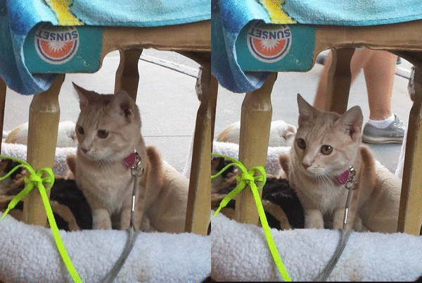
Note: This isn't my cat (but I wish it was ᵔᴥᵔ)

Concept Board


Ivan Chermayeff and Tom Geismar are prominent in the design world, as they are involved in every aspect- graphics, print, logos, posters, packaging, and so on. They both graduated from Yale University of Art and Architecture in 1957, and have been in business since 1958, when they opened their own graphic design firm. Since then, they have been pioneering and emphasizing the modern movement. Their work emerged during the 50s and early 60s, a time of graphic revolution, as only a few graphic designers were well known at the time. Around 1960, they began the "craze" for abstract corporate symbols, such as the logo for Chase bank. Chermayeff and Geismar have since re-designed and created identities for numerous major institutions, and their design firm is behind the logos for many major iconic brands such as National Geographic, NYU, and NBC.

(reposted because the font was different from the rest of my blog, and wouldn't change back)


Wednesday, October 8, 2014

"Good" Graphic Design


I think this is greeting card is an example of "good" graphic design. I chose this card because it's simple, yet eye catching (and it's cute). It also has a purpose, as it is a card for an anniversary, and the images and text help convey the message. I think it stands out because the pairs in the design go well together, such as salt and pepper or cookies and milk. The text is casual and adds onto the theme, and having the images and text form a heart helps bring the entire design together.

Found in Walgreens pharmacy~ 


Monday, October 6, 2014

Inspirations & Interests ♪


I like food- and it inspires me, too! Although I can't cook very well, when I see different ingredients, I always wonder what they can be made into when they are combined. This is similar to art, when different mediums can be used and combined to create new pieces of art. Food in general is inspiring, as there seems to be an endless variety, and new flavors are always being created (did you know that they have salty watermelon flavored Pepsi?). Although it's probably impossible, it would be cool to try every food...

Letter Project Reflection =^• ㅅ •^=


  • Describe your process when creating your letter project. How was the process helpful or not so helpful to you?

         I started my process of creating my letter project by sketching twenty  possible designs of a letter, then narrowed it down to three designs through peer editing. This was helpful for me because I had a few designs in mind, and my table chose those designs. Afterwards, I chose two designs and drafted them on copy paper. The gallery walk that followed was helpful for me because it helped me decide which design I wanted to create for my final. The input from my classmates gave me ideas on how to improve my design.
  • How did you arrive with your concept/idea for your letter? How did you represent this concept visually in your design?

          I don't think it was too difficult to arrive at the concept for my letter. I chose to design the letter "O" because it's a simple letter, and I like how it's round. My concept came from both the letter I chose, and my interests. Because I chose the letter "O" and because one of my interests is food, I decided to combine them. When I was working on the initial sketches, I drew a lot of food that is shaped like the letter "O," and some happened to start with the letter, too- Oreo's and oranges, for example. I eventually chose a pizza. I used a color scheme of mostly warm colors like red, orange, and brown, and added a bit of contrast with green. I think using the green helped unify my design more, as green and red are complementary colors. To add onto my concept, instead of just having regular pizza toppings, like pepperoni and mushrooms, I chose to add other foods that I like, such as M&M's and cherries. The additional toppings are unusual, as they aren't usually found on pizzas, but they fit into my design, as well as my preferences. I also wanted to make my design look cartoon-ish, but have realistic colors. The bite marks in the middle help emphasize both the letter and the cartoon look.
         
  • What was the most challenging aspect of this project for you? Why?

         The most challenging aspect of the project for me was adding color to my design. Since my design is a pizza, I had to combine different shades to create the end result. For the cheese part of the pizza, I overlapped different shades of orange, red, yellow, and brown, and for the crust, I did the same using different shades of brown. Even though my pizza is cartoon-ish, I wanted to make the colors look realistic. This was difficult for me because I didn't want to make the colors look too dark, and as a result, my coloring, and the color payoff, was not as bold as it could have been.
  • Are you satisfied with your project? Explain your answer.

         I'm satisfied with my project overall. Initially I thought that my design was too simple, but I think I like it that way. I'm not sure how it would look if I somehow made it more complex, but I don't think it would look as nice. I like the way it turned out, but if I could, I would make some adjustments to it.
  • If you can change anything about your design, what would you change or do differently?

         If I could do something differently, I would try to make my design stand out more. During the class discussion, I noticed that mine was somewhat hard to see from from away because of the way it was colored. To change this, I would try to add more color to my design while staying within my color scheme. However, with that said, I still like my design, and I think it looks nice up close.
    Final~
    In the process~


Tuesday, September 16, 2014

An Intro


Hello! I'm Denise. This blog was created for the graphic design course in my school, and possibly random posts in between. Here's a brief introduction- I live in New York City and I'm a senior at Millennium High School. Other than English, I can speak Cantonese and some Mandarin. I think it's fun to learn new languages and about different cultures. I like the Korean show Running Man~ I'm always eating, but for some reason I'm also always hungry. For lunch, I've been to Potbelly, Chipotle, Davinci's Pizza, Au Bon Pain, Hale and Hearty... And if someone pokes you in the hallway, it might be me (if I know you, that is). 


Most of my posts here will probably be about graphic design. I don't know if you can tell, but I like cartoons, so expect some... (the pixels don't show up in school, though... /sad) Hope you enjoy my blog~